Google+ is rolling out a new look for its header graphics on both business and individual pages. Here is a screenshot of a new design I updated for one of my clients’ pages (souchi):
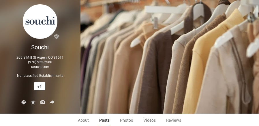
I must say, I like this new header design much better than the last update. I never understood the appeal of the previous layout, a humongous (2120 x 1192 pixels) image loaded the image partially scrolled down (meaning you could scroll up on load — weird). It was supposed to allow for a more fluid experience between giant Apple Thunderbolt-sized screens all the way down to tiny mobile phone screens. Obviously, I wasn’t the only one who didn’t like it because here we are with another new layout less than a year later.
What do you think of the design?
My next step is to fix the new “Nonclassified Establishments” category they tacked on!









I think it looks great! It’s clean but very stylish looking. How did you get the address under the name?
Thanks for stopping by, Jeff! The business must be set up as a local business to have the address appear in the header. If your page represents a website or a general brand, for example, it won’t get the address treatment — even if there is a corporate office address.
Pingback: Welcome to My Website! - Joe Has a Website